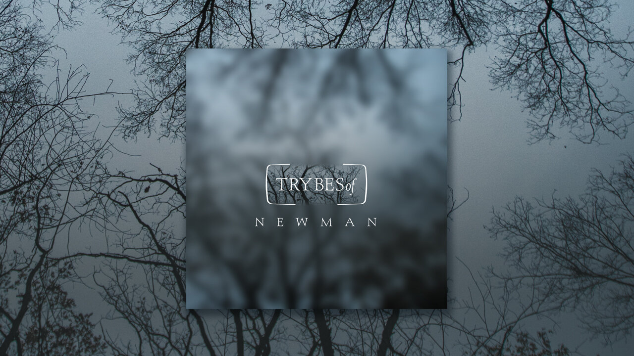
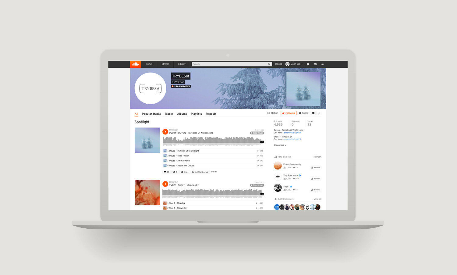
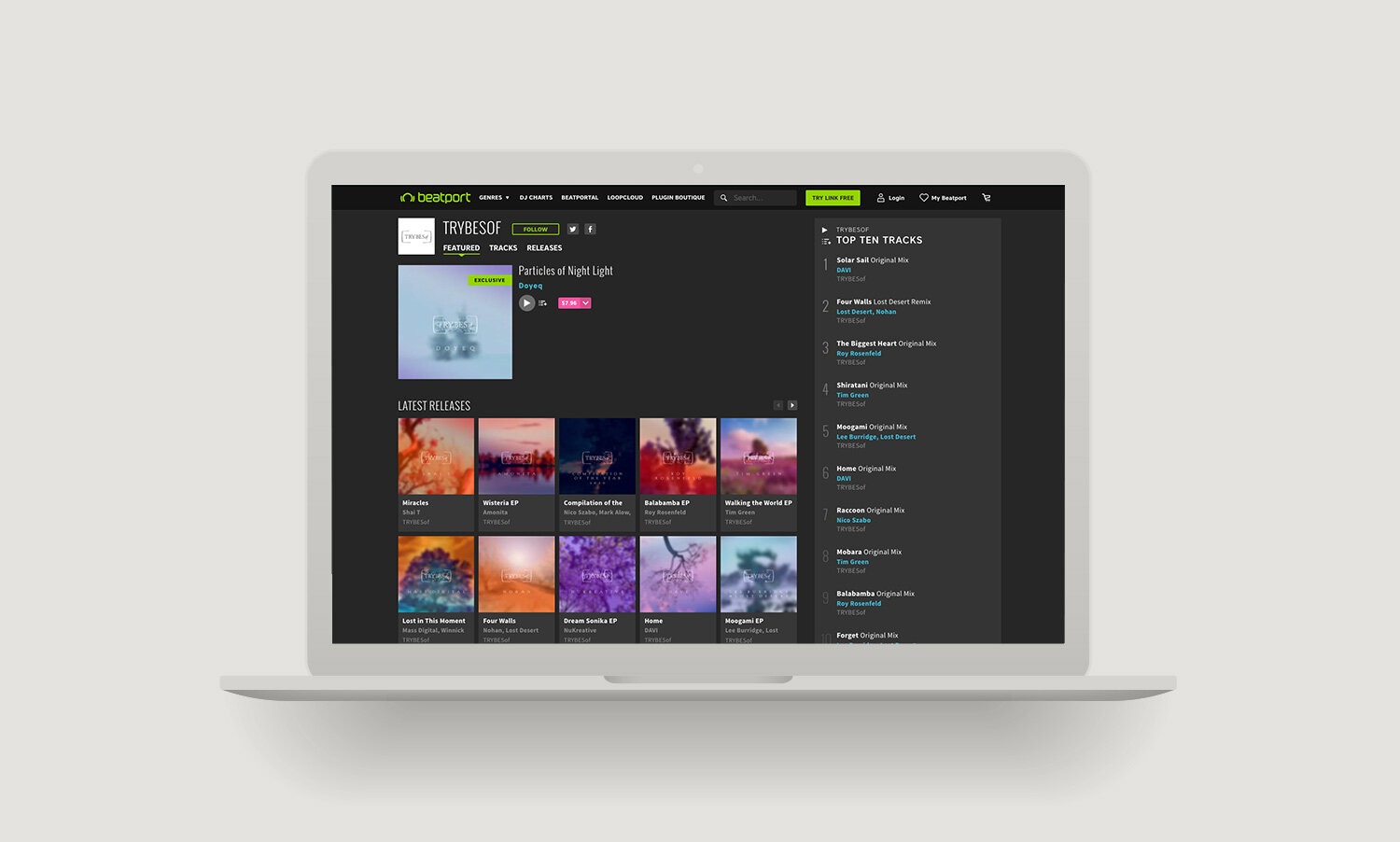
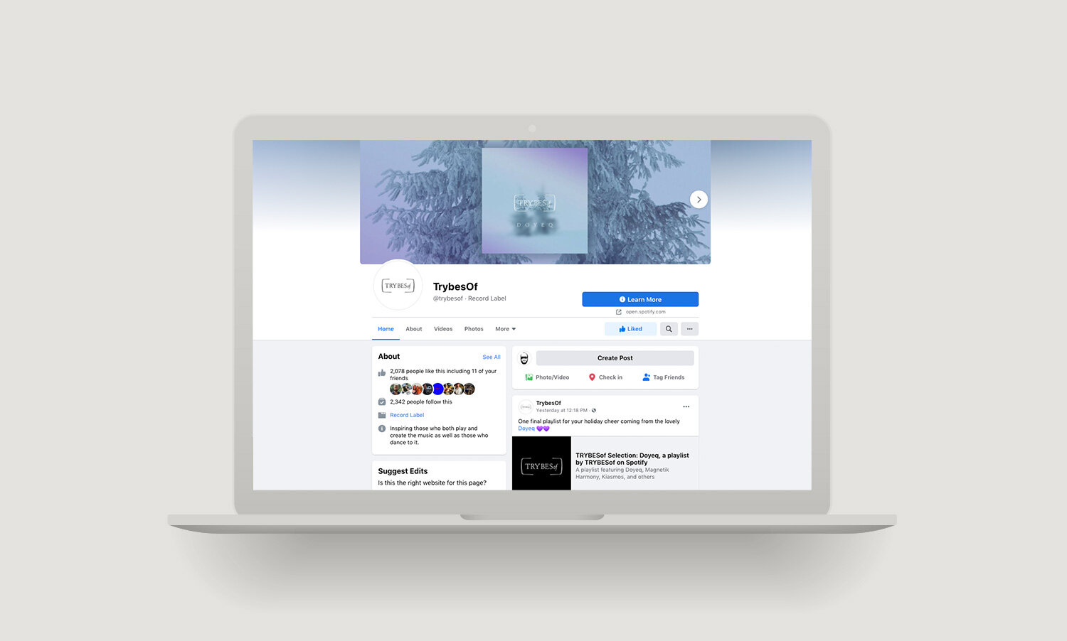
Justin Timberlake

Brand Identity
Web Design

Justin Timberlake’s team / my friend Faith-Anne Young approached me for this project, they liked that I was a DJ, Photographer, and a Designer and could get into the mindset of a multi-disciplined artist. The website's goal was to give Justin a unique platform to explore all his artistic and business endeavors. Did you know he is a photographer, a filmmaker, actor, performer, and entrepreneur in fashion and Liquor? My job was to provide three looks and feel mock-ups of the site, logo, color, and fonts. My final deliverable was one package with a chosen direction/edits. I later learned that this was for a platform asking lots of A-list artists to be involved - sadly, they did not launch the platform. I was still paid in full by JT's team :) And got to learn all about JT on this project - He found a fan for life.

 
john-dill-justin-timberlake-00.jpg
john-dill-justin-timberlake-01.jpg
john-dill-justin-timberlake-03.jpg
john-dill-justin-timberlake-04.jpg

Other Directions

john-dill-justin-timberlake-05.jpg
john-dill-justin-timberlake-06.jpg
john-dill-justin-timberlake-07.jpg


SWAROVSKI

Design & Layout

As a music lover and a designer, this project for Swarovski strummed a few cords. I was given many photos to work with, but the ones I chose lit me up. I wanted to contrast structure with abstract detail. And the cover was a nod to the disco ball. Released on Rasa Music.

 
john-dill-swarovski-05.jpg
john-dill-swarovski-01.jpg
john-dill-swarovski-04.jpg
john-dill-swarovski-03.jpg
john-dill-swarovski-06.jpg
john-dill-swarovski-02.jpg


the BLACK BOOK

Concept
Design & Layout


This project was one of those feel-good jobs - an honor to be asked "kinda thing." The Black Book was an annual printed book with the top illustrators in the world. They would send this out to all the agencies to find talent. Yes, this soon became obsolete with the internet of things. But print is still one of my favorite mediums. I was given carte blanche for the concept and access to illustrators to make the vision happen.

Time travel has always perked my ears, so I decided to create a time machine with a die-cut Dossier folder from the “CIA” shoved in it. A wacky idea that Black Book loved. My friend Mike Longo who pitched me for the job, was my point person / Art Director at Black Book and helped me find the perfect illustrators to rock the idea. I worked closely with them and then laid out the creative part of the book. I also created digital illustrations of my own for the internal pages and folder. I remember getting a copy of the book in the mail, and my jaw dropped. The printer executed the job perfectly.

Cover Art: Richard Borge
Masthead Art: Graham Smith

 
john-dill-blackbook-1.jpg
john-dill-blackbook-2.jpg
john-dill-blackbook-3.jpg
john-dill-blackbook-4.jpg
john-dill-blackbook-5.jpg
john-dill-blackbook-6.jpg
john-dill-blackbook-7.jpg
john-dill-blackbook-8.jpg
john-dill-blackbook-9.jpg
john-dill-blackbook-10.jpg
john-dill-blackbook-11.jpg
john-dill-blackbook-12.jpg
john-dill-blackbook-13.jpg
john-dill-blackbook-14.jpg
john-dill-blackbook-15.jpg
john-dill-blackbook-16.jpg
john-dill-blackbook-17.jpg


Maven

Art Direction
Brand Identity
Digital & Print Assets
Swag Development

Maven was about to launch itself into the world. So they decided to throw a grand ski event and invite all the key players in the publishing industry. My job was to create all the print and digital assets for the event. And rework the logo mark of their existing skeleton key logo and create a basic identity system and more modern stylized key.

Maven is a coalition of Mavens, from individual thought-leaders to world-leading independent publishers, operating on a shared digital publishing, advertising, and distribution platform and unified under a single media brand. Based in Seattle, Maven is publicly traded under the ticker symbol MVEN.

 
john-dill-maven-01.jpg
john-dill-maven-02.jpg
john-dill-maven-03.jpg
john-dill-maven-04.jpg
john-dill-maven-05.jpg
john-dill-maven-06.jpg
john-dill-maven-07.jpg
john-dill-maven-08.jpg
john-dill-maven-09.jpg
john-dill-maven-10.jpg
john-dill-maven-11.jpg


The Ocean Gala

Art Direction
Brand Identity
Digital / Print Assets
Web Design
Swag Development
Photography

Started by Mai Tai Global and the Ocean Elders.

The Ocean Gala was a fundraising event to support ocean conservation. As a collaborative community of passionate men and women, these organizations partnered to bring together today’s and tomorrow's global leaders in a collective effort to protect, value, and celebrate the ocean and its wildlife. I was blessed to work on this project for two years. We had a fantastic team - I was the creative director, tackling all the branding, digital, print, and swag needs. I also got to design a surfboard for the auction. And rock a DJ set one year and the next year my camera. But my favorite moment was having a dance with Sylvia Earle. She is an American marine biologist, explorer, author, and lecturer. She has been a National Geographic explorer-in-residence since 1998. A pure inspirational ocean badass. Have a peep at Mission Blue.

 
john-dill-ocean-gala.jpg
john_dill_nyc-Ocean-Gala-004.gif
john-dill-ocean-gala-8.jpg
john-dill-ocean-gala-9.jpg
john-dill-ocean-gala-10.jpg
john-dill-ocean-gala-11.jpg
john-dill-ocean-gala-1.jpg
john-dill-ocean-gala-2.jpg
john-dill-ocean-gala-4.jpg
john-dill-ocean-gala-5.jpg
john-dill-ocean-gala-6.jpg
john-dill-ocean-gala-18.jpg
john-dill-ocean-gala-16.jpg
john-dill-ocean-gala-13.jpg
john-dill-ocean-gala-12.jpg
john-dill-ocean-gala-14.jpg
john-dill-ocean-gala-15.jpg
john-dill-ocean-gala-7.jpg


EXTREME TECH CHALLENGE

Art Direction
Design & Layout
Photography
Swag Development

Another startup by Mai Tai Global - (Extreme Tech Challenge) recently partnered up with Samsung. EMPOWERING STARTUPS TO INNOVATE IN 7 KEY CATEGORIES INSPIRED BY THE UNITED NATIONS 17 SUSTAINABLE DEVELOPMENT GOALS THAT SERVE AS THE FRAMEWORK. I worked on this project at its inception, designing collateral and photographing the events. The first few events were held on Necker Island with Sir Richard Branson as one of the prominent judges. I loved learning about all the new technologies that improve life. I hope this new partnership with Samsung can be a catalyst to change the world in some way majorly. 


john_dill_XTC-1.jpg
john_dill_XTC-2.jpg
John_Dill-XTC-1.jpg
john_dill_XTC-3.jpg
john_dill_XTC-4.jpg
john_dill_XTC-6.jpg
john_dill_XTC-5.jpg
john_dill_XTC-7.jpg


SCOUT

Brand Identity
Design & Layout

I was hired to create the logo back in 2013. CBS kept the logo/mark after acquiring it in 2016, which is nice! The concept is straightforward - a compass vibe. While designing this, my inner child came out - I was a Cub Scout and a Boy Scout. The “merit badge” was my inspiration. I also helped them with the masthead of their first print magazine.

Scout Media is an integrated sports publishing company that produces Internet content covering hundreds of professional and college teams across America.] In 2013, Fox Sports sold Scout to North American Membership Group, which later rebranded to Scout Media. In December 2016, and was then acquired by CBS in February 2017 for $9.5 million.”

 
john-dill-scout-01.jpg
john-dill-scout-03.jpg
john-dill-scout-04.jpg
john-dill-scout-02.jpg
Cover photo by Peter Ruprecht

Cover photo by Peter Ruprecht


FURTHER FUTURE

Digital / Print Design & Layout
Marketing Assets
Website Images
Event Photography

This was a fun project; I was brought on board to work on digital and print assets - Including website graphics, social campaigns, banners ads, signage, posters, and event program and schedule timeline. I got to use, remix, and expand on creativity from some of my favorite creative people: Jason Swamy, Reka Nyari, Christian Lamb and Adam Pollina.

 
john-dill-further-furure-00.jpg
john-dill-further-furure-02.jpg
john-dill-further-furure-01.jpg
john-dill-further-furure-03.jpg
john-dill-further-furure-04.jpg
john-dill-further-furure-05.jpg
john-dill-further-furure-06.jpg
john-dill-further-furure-07.jpg
john-dill-further-furure-08.jpg
john-dill-further-furure-09.jpg
john-dill-further-furure-010.jpg
john-dill-further-furure-banner.gif

2015 Selects

John-Dill-FF-85.jpg
John-Dill-FF-52.jpg
John-Dill-FF-36.jpg
John-Dill-FF-143.jpg
John-Dill-FF-136.jpg
John-Dill-FF-139.jpg
John-Dill-FF-118.jpg
John-Dill-FF-108.jpg

2016 Stylized Selects

John-Dill-FF2-1.jpg
John-Dill-FF2--3.jpg
John-Dill-FF2--2.jpg
John-Dill-FF2--6.jpg
John-Dill-FF2--8.jpg
John-Dill-FF2--12.jpg
John-Dill-FF2--10.jpg


ALL DAY I DREAM

Brand Identity

This was the first design project I did for Lee Burridge. I took photos of the ADID events for a while (2011-2014). One thing I love about working with Lee is that he always has an idea in mind. And it was/is my job to make that come to life. Lee’s idea was a “man with his head in the clouds” and his request was to make it fresh.

The first thing I worked on was the cloud. How do you not make a cloud cartoon-like - This was the tricky part. It also needed to work in one color - EVERY good logo should work in one color. I ended taking a photo of a cloud, bring it into photoshop, and creating a Halftone - then bring that into illustrator and creating a vector. After I had it vectorized, I tweaked it a bit - can you see the elephant?

Next came the male body. And for this, I wanted to shoot a photo too. Since I did not have a full-length white backdrop, I asked Eva Mueller a long-time friend to shoot the picture. So yes, that is me in the logo, well mostly - I ended up tweaking it a bunch. Ironically my face logo has a body out there - this silliness cracked me up. 

The next part was the logotype - This is a mixture of font and some of my crafty handwork in illustrator to make it look perfect. It is hard to find an ideal script font that works with every letter. I was able to create a unique logotype. And also, find another script font that complemented it for use within the brand’s marketing materials. 

Lee sat on this artwork for a bit, until it was the right time to release it. And when that time came, he wanted a female version too - just as fresh! She is another story. x

 
john-dill-all-day-i-dream-01.jpg
john-dill-all-day-i-dream-02.jpg
john-dill-all-day-i-dream-05.jpg
john-dill-all-day-i-dream-04.jpg
john-dill-all-day-i-dream-06.jpg


GRIT NEW YORK

Brand Identity
Swag Development

This was a project for my homegirl Anne. She needed a badass name for her new business - One that had some range and toughness like her. We were spitballing names, and I sad Grit New York. We both were like f$ck yeah - that is money. And so I got to work — my idea was to take a classic font pairing and make it street. So that is what I did - using Bodoni and Futura. 

After five years in business, we did a little swag. I used the lyric “I got 5 on it” as inspiration. When playing in illustrator, I flipped the 5 upsides down, and it looked like a cool G. $hit like that always puts a smile on my face.

 
John_Dill-design-grit-1.jpg
John_Dill-design-grit-2.jpg
john-dill-grit--photo.jpg
John_Dill-design-grit-4.jpg
John_Dill-design-grit-6.jpg
John_Dill-design-grit-5.jpg


KEEPER

Design & Layout
Photography

It is such a pleasure to work with other creatives and help them push their vision into reality. Ashley is a unique being, and her brand Keeper is out of this world. She has such an eye for design and photography that working with her is pure fun. Over the years, we have worked on a lookbook and numerous photoshoots. And lots of other creative exchanges and idea slinging. Keeper for life, I am. Cheers to the journey!

Keeper is a unisex conceptual jewelry line fabricated in Brooklyn. Each piece is designed in flight, characterized by its peculiarly classic geometries.


Rae

Brand Identity
Web Design

Rae came to me with identity and website needs. She is an incredible set designer and had an idea of using textures of wallpaper and wood patterns in the design. My job was to take that mix and turn them into what you see here. The trick was to make it work with three colors and get the tints right - I remember going back and forth with the printer three times with test prints to nail it.

 
john-dill-rae-01.jpg
john-dill-rae-05.jpg
john-dill-rae-02.jpg
john-dill-rae-03.jpg
john-dill-rae-04.jpg
john-dill-rae-06.jpg
Promo graphic

Promo graphic


How to grow a mask

Illustration
Art Direction
Design & Layout

“Do you ever wonder who is really behind the masks of the hacker group, Anonymous? Meet one of their members, Haardt Zongo, a modern-day explorer, and revolutionist.” Right from the get-go, this project intrigued me. It was September 20th, 2013; I received a message on Facebook from the author that two friends had recommended me for this project. After talking with Josh Sitter, I decided to jump on board and work on the illustration & layout for the ‘How to Grow a Mask’ book project.

 
john-dill-how-to-grow-a-mask-01.jpg
john-dill-how-to-grow-a-mask-03.jpg
john-dill-how-to-grow-a-mask-02.jpg
john-dill-how-to-grow-a-mask-04.jpg


ROBOT HEART

Design & Layout
Photography

Robot Heart put out its first SoundCloud set 2010 - Just using the logo as artwork. In 2012, we created a photo-based cover for Swamy and my four hour burn night set. Eight years later, we are still going strong. If you look at each year, you can see a loose concept for images. This Soundcloud account is a team effort (Swamy, Benj, Dave, Gaby, Justin and me) - I just get to play in photoshop, make things look as good as can be, and find fitting images for each release. Th A majority of the photos (2015, 2017, 2018) I used for the layouts are mine and Christian Lamb's dusty gems. But It has been a community effort that has pushed them along adding such variety and depth over the years (Especially, 2016 art series). Such a pleasure to work with many gifted photographers over the years: Matan Tzinamon, Curtis Simmons, Andrew Jorgensen, Cliff Baise, Julian Walter, Jim Parisi, Peter Ruprecht, Aaron Feinberg, Seth Bunting, Manuel Pinto, John Curley, Karim Tabar and Regan Parrish (please let me know if I have missed anyone). 2019 we only used portraits from Jean Sini. 2012-2014 was another mixed bag of dusty photographers, including some from my lens.


Trybes of

Brand Identity
Design & Layout

Lee Burridge came to me with a little seed in his head and asked me to design a project logo for ‘Trybes of’. Originally we were thinking of a tree in the logo. But after much play, it became clear that the trees would live in the imagery. And the logo mark became a bit of a container that pushed the “tribe” concept even further. 

Imagine a tree as a community, and within that community, there are sub-communities. The mark is sectioning one sub-community - but still being open on both ends for it to flow through. We decided to use the seasons to push the imagery along. Abstracting the tree a bit on the cover art, but revealing the details of the tree on the social banners. The way I designed this vibe lends itself to endless possibilities. Well, maybe not infinite. But the concept can continue to grow and evolve with ease. I am excited to see this brand developer.


Peter Hughes

Brand Identity
Web Design

Peter Huges and I met at Burning Man 2019. At the end of a long conversation - him being a performance coach came up. I happened to be looking for a coach. A few months later, we started working together. 

The dynamic lent itself to me, observing the way Peter works in a personal way. He was helping me grow my business amongst other threads of life. And I got to get the true vibe of his style and skill set. 

I helped Peter with his logo, brand identity and website. I must admit having killer photos shot by his fiancée Inna made the website come to life in such an authentic way.


john_dill_peter-hughes-coaching-logo2.jpg
john_dill_peter-hughes-coaching-computer.jpg
john_dill_peter-hughes-coaching-home.jpg
john_dill_peter-hughes-coaching-life-coach.jpg
john_dill_peter-hughes-coaching-process.jpg
john_dill_peter-hughes-coaching-about.jpg
john_dill_peter-hughes-coaching-work.jpg


Norbert Health

Art Direction
Brand Identity
Design & Layout

When Norbert explained their product to me, I was excited to dive into two of my favorite topics, health and technology. Initially, I was commissioned for a logo, branded images and color/font guide. But soon dove into creating their website, Google Slide product sheet and online ads. 

Norbert Health: In an ideal future, our health will be monitored by ambient sensors that will understand our vital signs, detect nearly invisible health issues, and predict problems before they occur so that we can prevent them from happening at all. We are building the product and technology that will make this future possible.


john_dill_Norbert Health-logo.jpg
john_dill_Norbert Healthscreen_back.jpg
john_dill_Norbert Health-fc-ad.jpg
john_dill_Norbert Health-ac-ad.jpg
john_dill_Norbert Health-le-ad.jpg
john_dill_Norbert Health-web1.jpg
john_dill_Norbert Health--screen.jpg
john_dill_Norbert Health-web2.jpg
john_dill_Norbert Health-peach-screened_back.jpg
Digital product sheet

Digital product sheet


tea huntress

Web Design


john_dill_peter-hughes-coaching-computer.jpg
john_dill-tea-huntress-home.jpg
john_dill-tea-huntress-membership.jpg
john_dill-tea-huntress-bespoke.jpg
john_dill-tea-huntress-clean.jpg
john_dill-tea-huntress-about.jpg